Let’s be honest — local magazine adverts aren’t just about filling a space on a page. They’re little ambassadors for your business.
Whether you’re a dog groomer in Queen’s Hills, a florist in Hellesdon, or a handyman in Costessey, your advert needs to say: we’re local, we’re brilliant, and we’re ready to help. Here’s how to design a local magazine advert that actually gets noticed… and remembered!
1. Keep it simple, stupid!
I get it, you’ve got loads to say. But a good advert isn’t a CV. It’s more like a friendly wave from across the street. Keep it simple. One clear message is far more effective than squeezing in every service you offer, your full price list, and the history of your business since 1992.
- Pick one main focus
- Use fewer words, not more
- Leave some breathing room – white space is your friend!
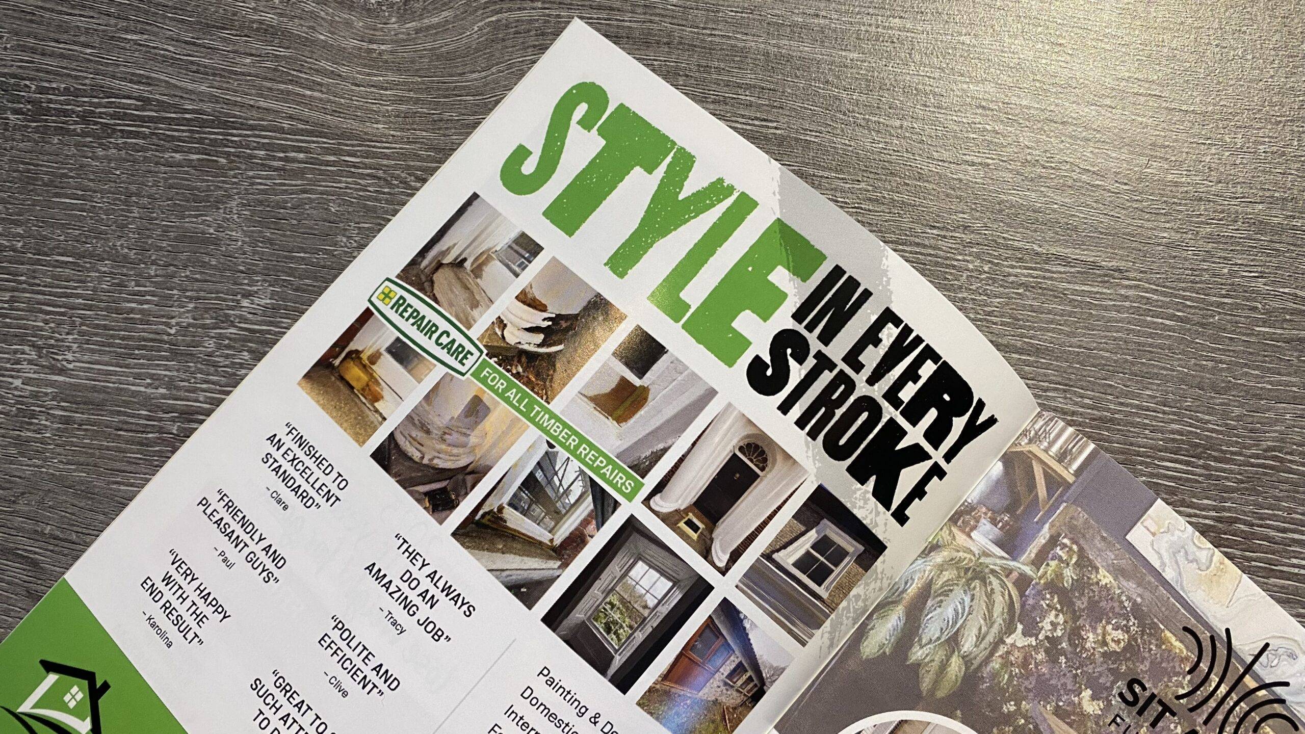
2. Use images that do you justice
A blurry photo of your van taken on a rainy Tuesday isn’t doing you any favours. A sharp, well-lit photo — even from your phone — can make a huge difference. And if your logo looks fuzzy when you zoom in, it’s time to get hold of a better version.
- Send us the biggest, best version of your images
- Avoid anything that looks stretched, dark or pixelated
- Make sure your logo is readable at a glance
3. Keep it “on brand” (even if your brand is just you)
If your business has a certain style — whether it’s bold and bright or warm and homely — stick with it. Your advert should feel like it belongs with your website, social media and shopfront. Not sure what your “brand” is? No problem. Just make it feel like you.
- Stick to your usual colours and fonts
- Use your natural tone of voice – formal, friendly or fun
- Don’t reinvent the wheel each time
4. Always include the basics
You’d be surprised how often people forget the simple stuff. If someone loves your ad, make it easy for them to get in touch. Phone number, website, and location at the very least.
- Make sure your contact details are easy to spot
- Add a clear call to action: Call today, Book online, Pop in and see us
- No tiny print (unless it’s legally required!)
5. Size isn’t everything… but it helps to be consistent
A full-page advert can make a splash, but even a small ad can work wonders if you run it regularly. Repetition builds trust. People start to recognise your name, your colours, your offer. So if budget’s tight, run a quarter-page ad across several issues rather than blowing it all on one.
- Little and often works wonders
- Be realistic about what fits in your chosen ad size
- Consistency > novelty
6. Avoid the rainbow explosion
We love colour, but there’s a fine line between eye-catching and eyesore. Stick to two or three colours that suit your brand. Choose fonts that are clear (it’s sometimes good to imagine how your ad looks on a busy coffee table), and don’t try to squeeze five different styles into one ad.
- Clear beats clever
- Contrast is key – don’t put yellow text on a white background
- If in doubt, we’ll help you tidy things up
7. Remember who you’re talking to
This isn’t national press — it’s your neighbours. Your future customers. Your fellow school-run parents, dog walkers, and allotment-diggers. So be friendly, local, and relatable. If you’re based in the area, say so! People love to support local.
- Mention your connection to the area
- Highlight offers or services that matter locally
- Talk like a human, not a marketing robot
Finally: Ask for help!
That’s what we’re here for! We don’t expect everyone to be a graphic designer. If you’re stuck, or you’re spending all day trying to put a design together, stop wasting your valuable time. Send us your logo, contact details and maybe a photo or two – and we’ll put something together for you. No stress, no fancy jargon.
Need help with a design?
We’re local, too, we want your advert to work. If you’re looking to advertise and need a design put together, or an existing one updated, get in touch today.